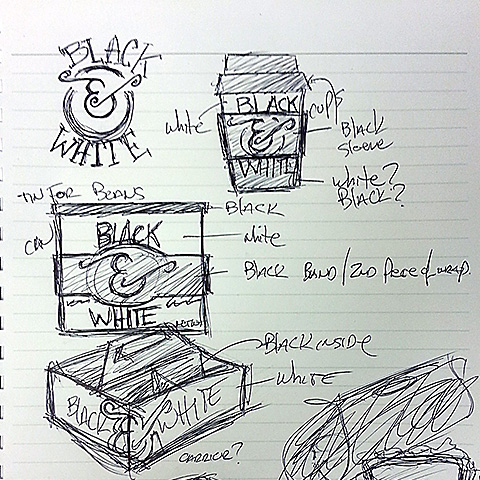
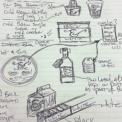
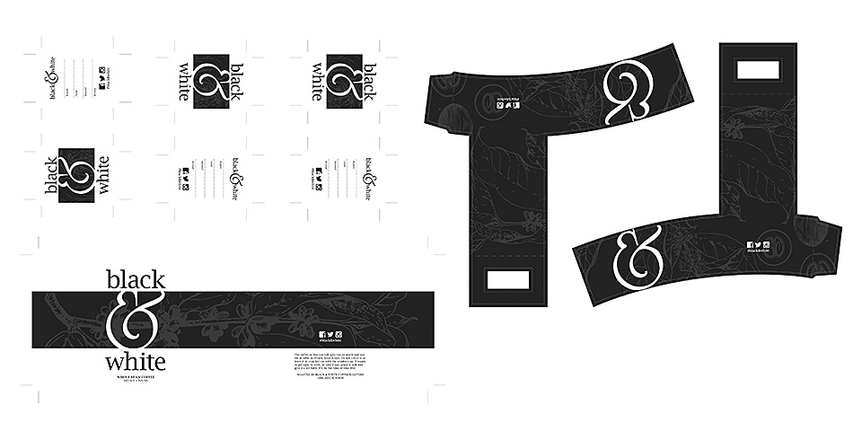
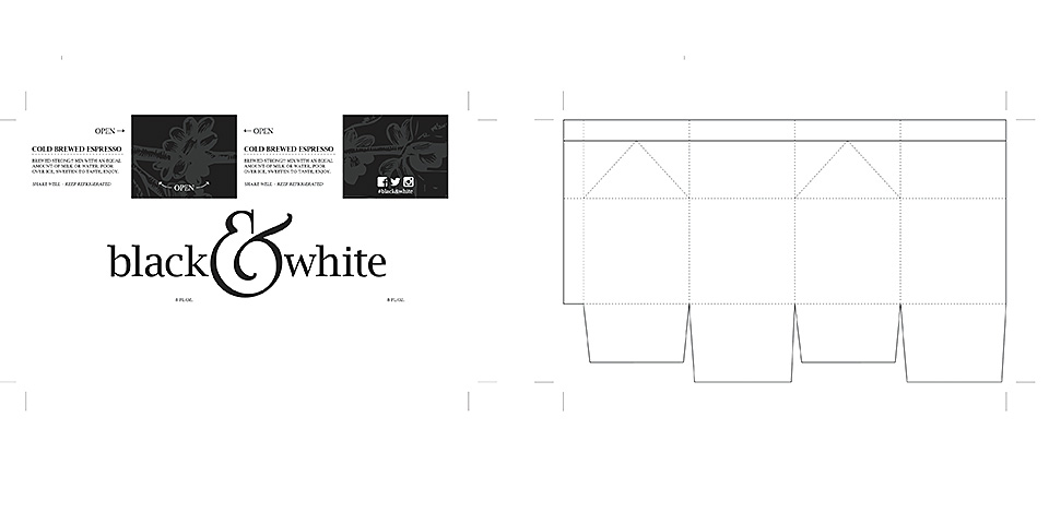
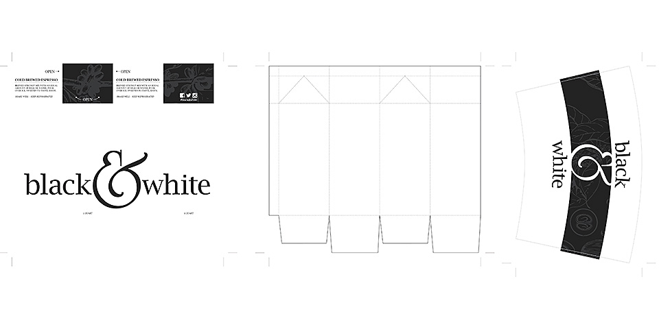
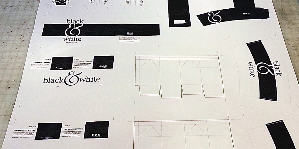
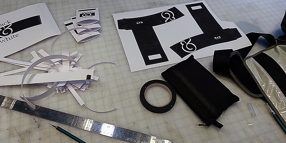
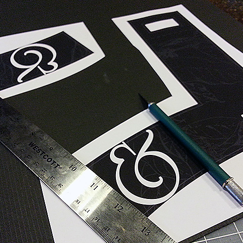
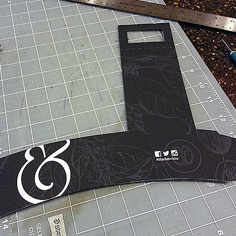
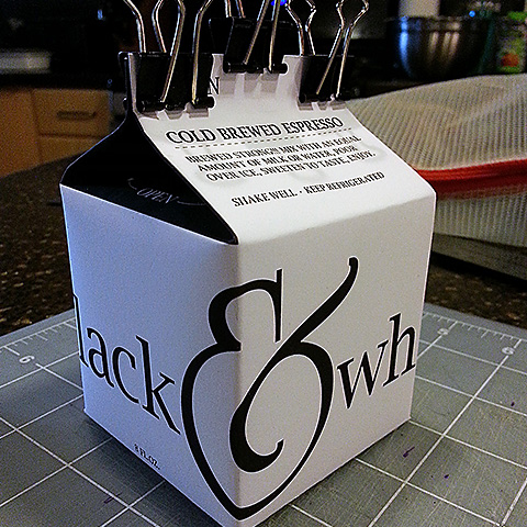
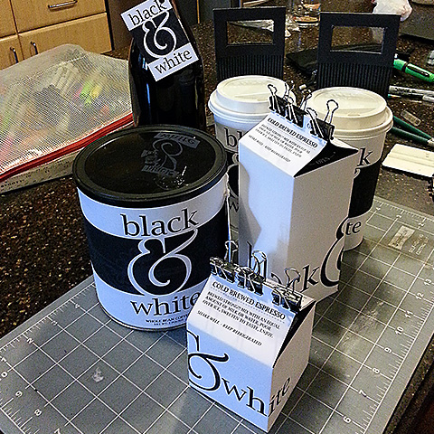
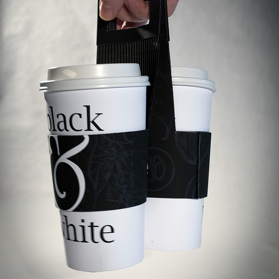
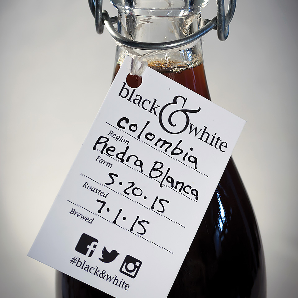
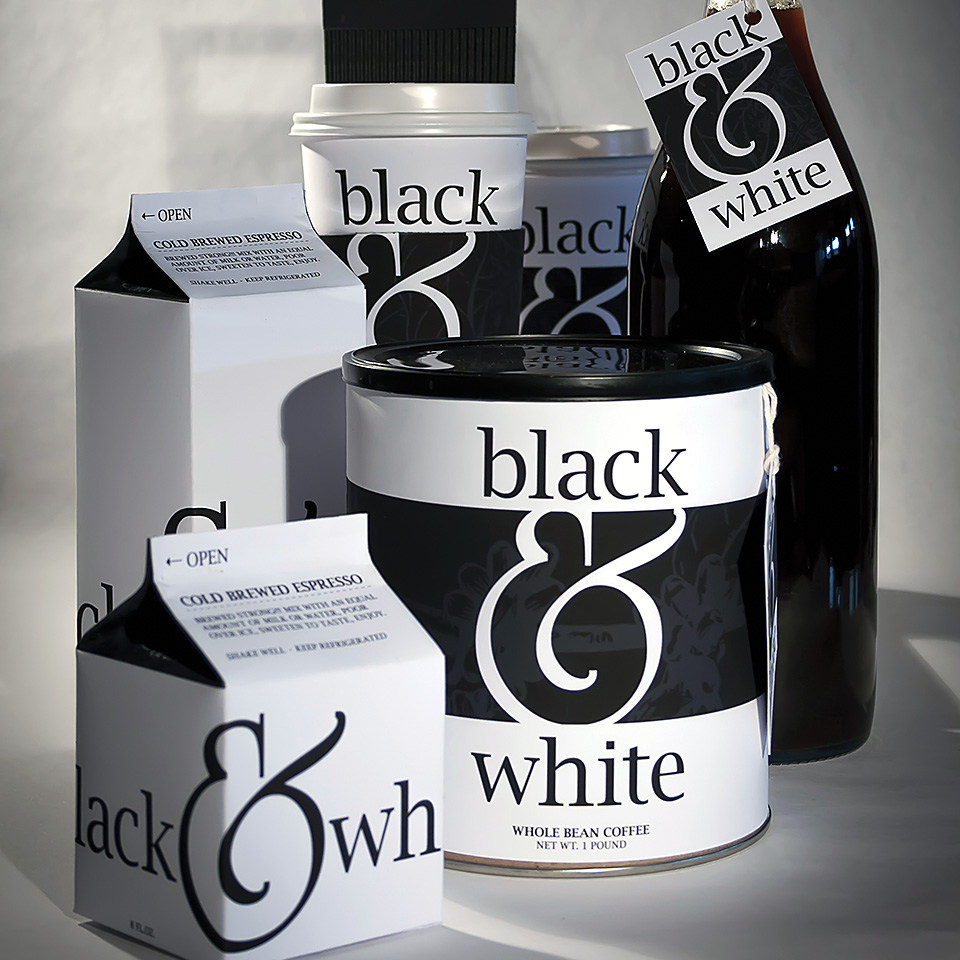
Black & White was conceptualized as a minimalist coffee brand with packaging that embodies a “no-frills” ethos, focusing purely on quality coffee. Extensive research and sketching helped shape the idea of using clean lines and a restrained color palette for a streamlined packaging suite, where every side of each package element was thoughtfully designed to showcase simplicity. A custom hybrid sleeve-carrier was also developed, combining a thermal sleeve with a dual-cup carrier for easy transport, aiming to reduce waste and enhance functionality.
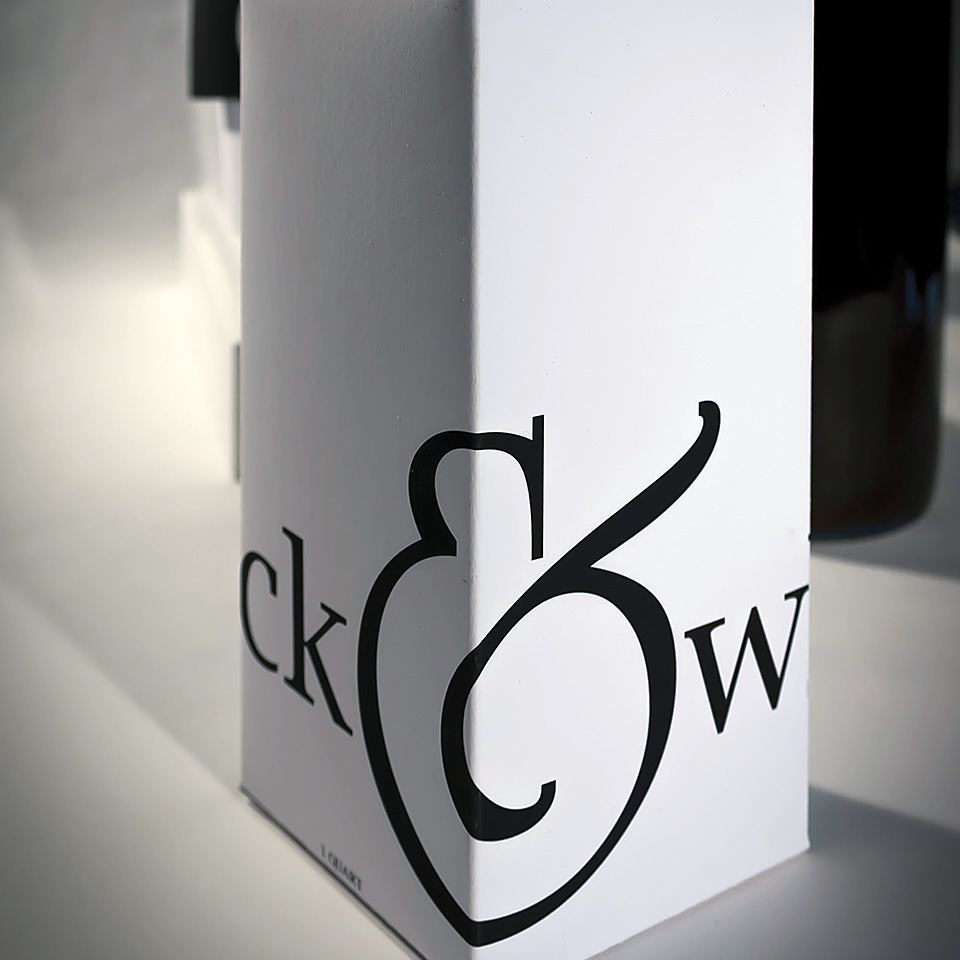
Central to the brand’s identity is the custom Black & White logo, where an exaggerated ampersand takes center stage. This symbol was carefully chosen to evoke both the swirling shapes of latte art and the rounded form of a coffee mug and handle, capturing the brand’s focus on the artistry and craftsmanship of a good cup of coffee. Through sketching and iteration, the logo evolved to become both a visual anchor and a representation of the coffee experience itself.
In creating packaging comps and conducting final product photography, the intention was to communicate the quality of the coffee in a refined, simple design. The uncluttered, polished look of Black & White’s packaging reflects the premium nature of the product and reinforces the idea that sometimes, less is more—allowing the coffee to speak for itself.