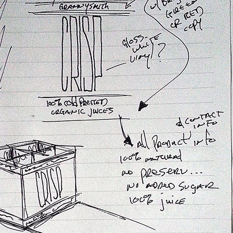
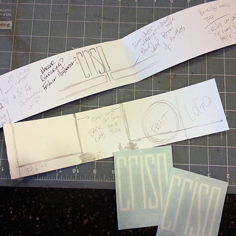
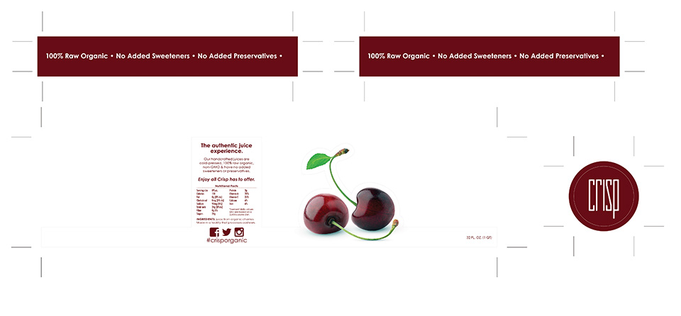
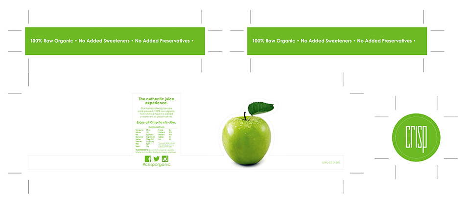
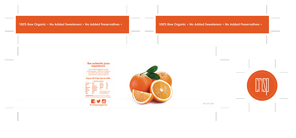
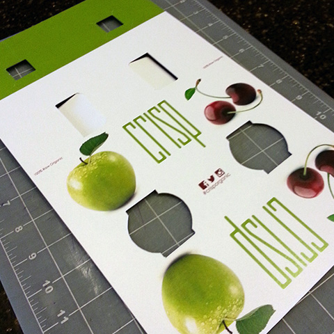
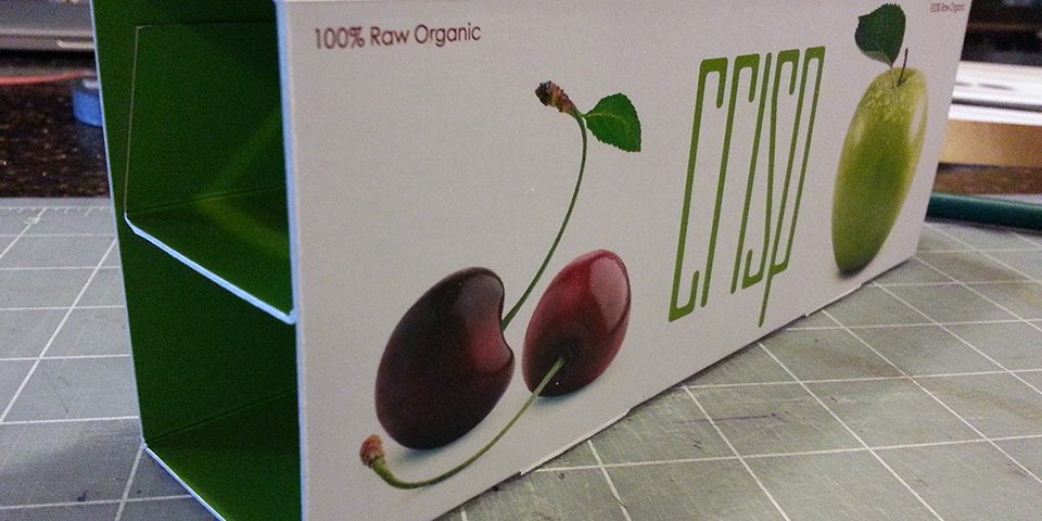
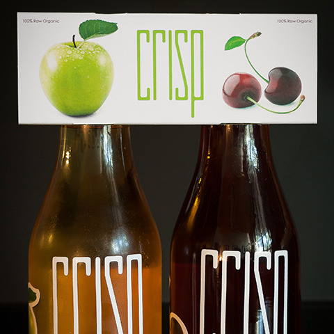
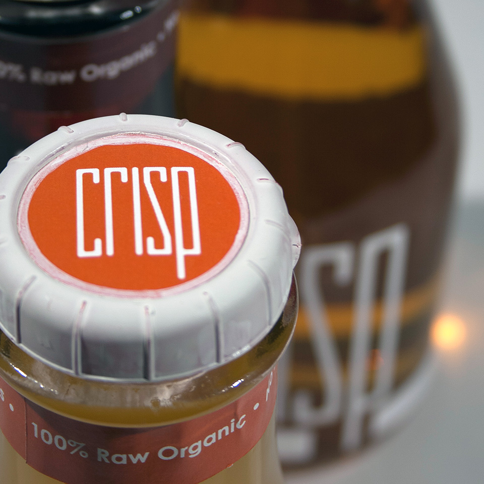
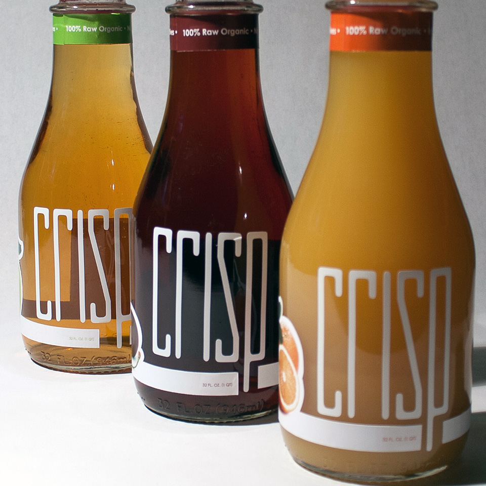
Crisp is a conceptual juice brand inspired by the farm-to-table movement, celebrating nature's bounty in every bottle. Rooted in research, sketching, and ideation, the brand captures the essence of freshness, with a name that evokes the sound of biting into a fresh apple. The custom typeface, designed specifically for Crisp’s logo, features tall, slender letterforms that reinforce the sense of crispness and purity central to the brand’s identity.
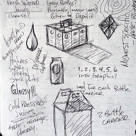
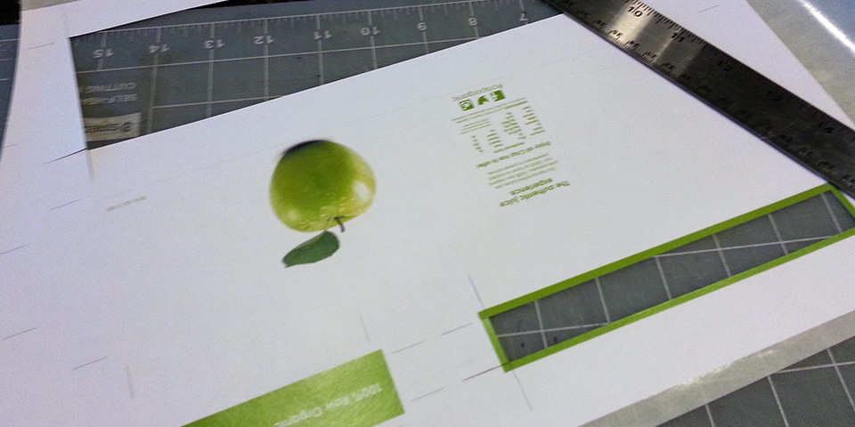
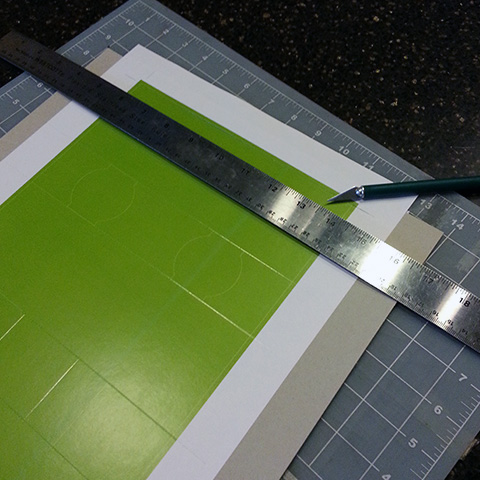
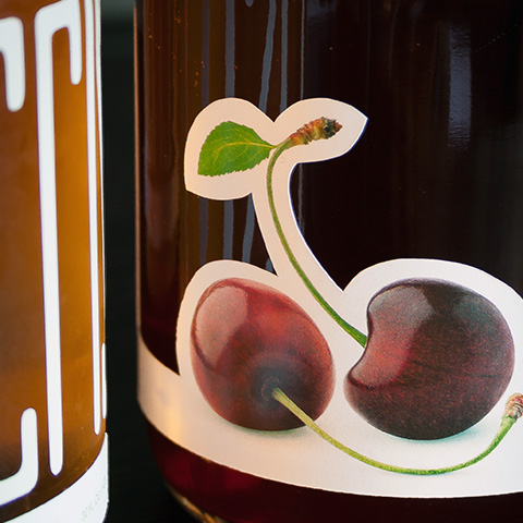
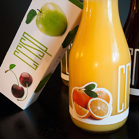
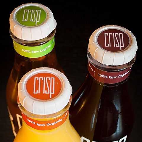
The clean, white packaging design symbolizes the unadulterated quality of Crisp’s cold-pressed juices, and vibrant photography of fresh fruits showcases the brand's commitment to purity and indulgence. Through careful packaging design, sketching, and creation of detailed packaging comps, each element underwent refinement to bring Crisp’s visual story to life.
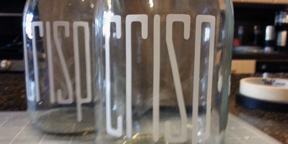
Crisp’s dedication to sustainability is also evident in its glass bottles, chosen for their freshness-preserving qualities and recyclability. Final product photography highlights the clarity of the glass, the vivid juice colors, and the thoughtfully designed labels, underscoring Crisp’s commitment to quality and the environment.